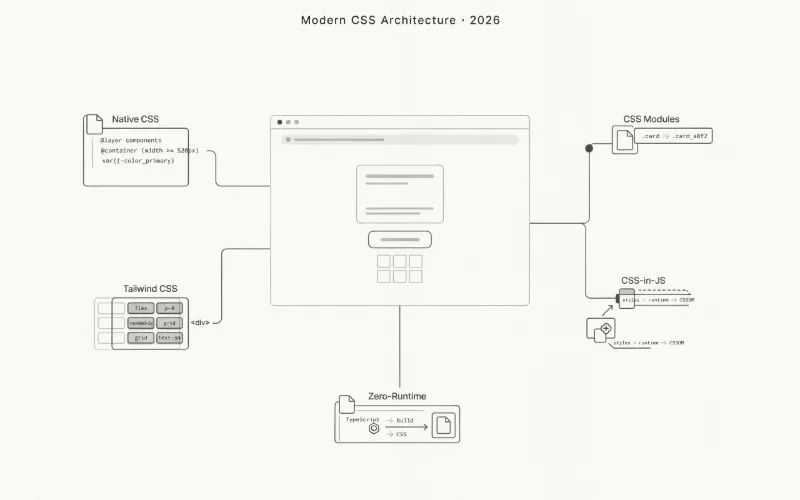
CSS in 2026: Modules, Tailwind, CSS-in-JS, and More
A practical guide to modern CSS architecture, from native browser features and scoped styles to utility classes and build-time extraction.
以下正文同步自 Hacker News 最新,版权归原站所有,已转换为易读排版。
A practical guide to modern CSS architecture, from native browser features and scoped styles to utility classes and build-time extraction.
CSS has changed considerably over the past few years. A separate stylesheet is still a perfectly reasonable choice, but it is no longer the only way to organize styles in a web application.
CSS Modules solve naming conflicts. Tailwind provides a utility-first workflow. CSS-in-JS libraries bring styles into JavaScript, while zero-runtime tools move much of that work into the build process.
Meanwhile, CSS itself has gained features that once required preprocessors, JavaScript, or third-party libraries.
There is no universal winner among these approaches.
A small content website has different requirements from an interactive dashboard. A component library needs different guarantees from a landing page. A large application with an established design system may benefit from conventions that would be unnecessary in a smaller project.
The useful distinction is not which syntax looks cleaner. It is where the styling work happens, what reaches the browser, and how difficult the resulting code will be to maintain.
This guide compares the main approaches available in 2026, explains their trade-offs, and shows how modern CSS can reduce the need for additional tooling.
Before introducing another styling library, it is worth looking at what browsers already support.
Modern CSS includes custom properties, nesting, cascade layers, container queries, and scoped styling. These features address several problems that previously pushed developers toward preprocessors or CSS-in-JS.
For many projects, native CSS is a realistic starting point.
Custom properties allow styles to share values without repeating them across selectors.
:root { --surface-primary: #ffffff; --surface-secondary: #f4f4f5; --text-primary: #18181b; --text-muted: #71717a; --border-default: #e4e4e7;
--radius-card: 12px; --space-card: 24px; }
[data-theme="dark"] { --surface-primary: #18181b; --surface-secondary: #27272a; --text-primary: #fafafa; --text-muted: #a1a1aa; --border-default: #3f3f46; }
.content-card { padding: var(--space-card); border: 1px solid var(--border-default); border-radius: var(--radius-card); background: var(--surface-primary); color: var(--text-primary); }
Changing the data-theme attribute updates the values used by every matching component.
There is no need to generate a new stylesheet or calculate separate rules for each element.
JavaScript only needs to update the attribute.
function applyColorScheme(preference) { const supportedSchemes = new Set(["light", "dark"]);
if (!supportedSchemes.has(preference)) { return; }
document.documentElement.dataset.theme = preference; }
applyColorScheme("dark");
This approach works with plain HTML, Astro, Vue, Svelte, React, and practically any other frontend environment.
The styling system belongs to CSS rather than a particular component framework.
Native CSS nesting reduces repetition when selectors share a common parent.
.article-card { padding: 1.5rem; border: 1px solid #e4e4e7; border-radius: 0.75rem;
& h2 { margin: 0; font-size: 1.25rem; }
& p { color: #52525b; line-height: 1.6; }
&:hover { border-color: #a1a1aa; }
@media (width >= 768px) { padding: 2rem; } }
A separate Sass compilation step is no longer necessary just to nest selectors.
Sass still offers additional features, including mixins and build-time functions, but nesting alone is no longer a compelling reason to introduce it.
Large stylesheets often become difficult to maintain because selectors compete through specificity and source order.
Cascade layers provide an explicit way to organize the cascade.
@layer reset, base, components, utilities;
@layer base { body { margin: 0; font-family: system-ui, sans-serif; }
button { font: inherit; } }
@layer components { .action-button { padding: 0.75rem 1rem; border: 0; border-radius: 0.5rem; background: #18181b; color: white; } }
@layer utilities { .visually-hidden { position: absolute; width: 1px; height: 1px; overflow: hidden; clip-path: inset(50%); white-space: nowrap; } }
For normal declarations, a later layer takes precedence over an earlier one, even when the earlier selector is more specific.
This makes the intended priority of different stylesheet groups easier to understand.
One detail matters: unlayered normal declarations have higher precedence than layered normal declarations. Important declarations follow different layer precedence rules.
Layers are useful, but they still require a deliberate strategy.
Traditional media queries respond to the viewport.
Container queries respond to the available space inside a particular container.
That distinction is useful for reusable components.
Lightweight design with active noise cancellation.
正文由 探How 从来源站点 RSS 同步,内容未经改写;遇到排版缺失或需要图片、视频时请以原文为准。