Mastodon 5.0: A closer look – Mastodon Blog
October is here, and it’s almost time for Mastodon’s 5.0 release! We announced our plans for big changes in an early preview back in August. In this companion article, we’re hoping to shed light on som…
以下正文同步自 Hacker News 最新,版权归原站所有,已转换为易读排版。
Back Oct 19, 2026New Features
Share on
5.0: A closer look
Imani Joy
October is here, and it’s almost time for Mastodon’s 5.0 release! We announced our plans for big changes in an early preview back in August. In this companion article, we’re hoping to shed light on some of the decisions behind this major UI overhaul.
Between the feedback we’ve gathered during Discovery Week, an event in which we spent a week doing surveys and workshop sessions with volunteers from the community, and Mastodon’s 10th anniversary coming up, we were determined to deliver something notable.
Working on Mastodon’s engineering team can sometimes feel like harvesting wheat one stalk at a time. We make a lot happen with limited resources–far more limited than most people realise–but there’s always more to do. There’s more tech and UX debt than is obvious to the naked eye, so something that seems simple on the outside may be often limited by backend constraints or architecture shifts that can’t easily be changed. So we had to make concessions about what we could realistically fit into our 5.0 plans, and leave some work for later.
What’s better for one person can be worse for another, and we’ve had to keep that in mind throughout the redesign. We’re acutely aware that such a divide is most pronounced between longstanding users and newcomers. Mastodon’s current UI is beloved by many longtime users, since it can be very powerful once you’ve learned its secrets and quirks. However, newcomers should be able to dive in without being overwhelmed. To keep the community fresh, alive and diverse, we need to break down the barriers to joining, so when you bring your friends, they can find their way around without a manual.
The redesign was grounded in these principles:
Clarity trumps convenience. The most powerful interface can be useless if it’s too difficult to figure out. Making things more clear and obvious can result in more friction, and that can be necessary.
Leave room for what’s to come. Navigation may feel emptier for now, and that is on purpose. We have lots of improvements planned that we need to leave space for, to avoid moving more elements around in the future.
Small improvements matter. We might not be able to fix everything overnight, but we’ll continue to look for small but meaningful improvements to accessibility and usability.
Our previous blog post covers most of the big stuff: We’re moving away from the embedded composer and adopting a pop-out composer with new controls for visibility and other post settings. Navigation is simplified and organised in a more intuitive way and create space for future new features.
The desktop 5.0 web interface showing the post composer opened at the bottom of the main column.
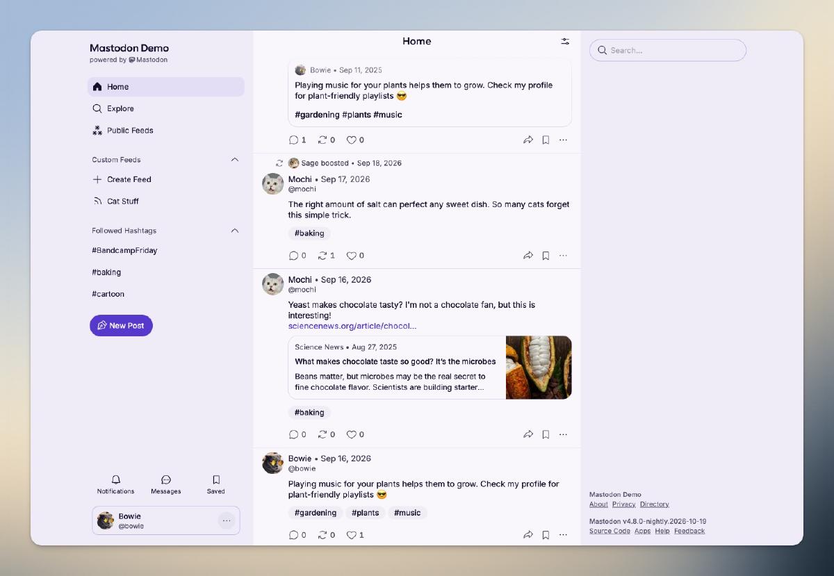
In your feeds, the posts themselves have been rebuilt from the ground up, giving a fresh look to the places we all spend the most time. We’re also excited to roll out a few new colour themes, which took a truly monumental effort from our engineering team since the start of the year to tokenise our design system.
The web interface, changing between the five available theme colours.
The new design includes many small affordances, such as hiding a user’s boosts directly from the post menu, following and unfollowing hashtags right from the post, and hiding your own posts and boosts in your home feed.
Under Advanced Settings, two new options allow you to decide if your own boosts and posts appear in your main feed.
Since our original announcement, we’ve iterated a lot on the feedback we’ve been receiving, so you’ll notice that the UI looks a bit different than what we’ve shown in that blog post. Here’s what’s changed:
How did you make sure these changes reflect the needs of actual Mastodon users?
We ran a week of surveys and workshop sessions with volunteers from the community to figure out what works for people and what doesn’t. We also monitored feedback from the initial blog post, then tested our prototype, first internally, then with users, gathering more feedback on our new Discourse space while iterating on the designs.
What about existing users having to re-learn the interface?
We understand that an interface you’ve been using for years changing under you can be frustrating. Whenever possible, we’ve based the redesign in existing UI patterns used frequently across the web, so that learning the new way would be easy. We are also communicating clearly about those changes through our blog and announcements to ensure that this transition is not a surprise and the reasons behind it are clearly laid out.
Additionally, our decision to fill less space in the 5.0 interface is precisely so we can minimize jarring changes across future releases.
We’re headed towards more roundness to invite a friendlier brand tone, and to make Mastodon feel more native within modern browsers (most of which have adopted a rounded aesthetic).
We hope you do! Head to our new Discourse forum. While we can’t immediately respond to every topic, we will be reading through each piece of feedback. Please remember to be civil even if you don’t like something: We are people too.
If you are on mastodon.online or another server running nightly updates, you already have early access to the redesign. We are planning to enable this new design on mastodon.social tomorrow, on the 20th October, and then release the first Mastodon 5.0 beta version so server administrators can try it out as well.
What you share in our forum could help us make a few more improvements before 5.0 is officially released to the wider Mastodon universe in a few weeks.
There are essential pages that still desperately need an overhaul: Search, Settings, Messages, and Notifications, to name a few. It’s unlikely we’ll be able to redesign all of those in 5.1. We can say with certainty that the search & discovery experience will be a priority, though.
正文由 探How 从来源站点 RSS 同步,内容未经改写;遇到排版缺失或需要图片、视频时请以原文为准。