Show HN: Kernwise – Kerning Game for Designers
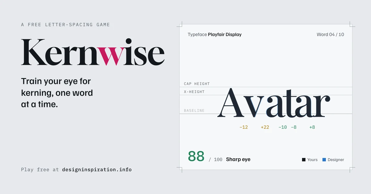
Kernwise is a free browser game that trains your eye for letter spacing, one word at a time. You drag letters until the gaps look even, then see how close you came to the spacing the type designer built into the font.
以下正文同步自 Hacker News 最新,版权归原站所有,已转换为易读排版。
Kernwise is a free browser game that trains your eye for letter spacing, one word at a time. You drag letters until the gaps look even, then see how close you came to the spacing the type designer built into the font.
Every designer has seen it happen. You set a headline in a lovely typeface, and something feels off. The “W” and “A” sit miles apart while the “r” and “n” almost touch. That’s a kerning problem, and the fix depends on your eye more than any software setting.
The good news is that a good eye can be trained. Kernwise turns that training into a quick game you can play in a coffee break.
Play Kernwise now – it runs in your browser, with no sign-up and nothing to install.
Kerning is the adjustment of space between two specific letters so a word reads with an even rhythm. Letters have very different shapes. An “H” has two straight sides, an “O” is round, and an “A” or “V” leaves big empty triangles beside it. If every letter got exactly the same distance, the word would look patchy.
Good spacing is optical, not mathematical. The goal is for the area of white space between letters to feel the same, even when the measured distances differ. That’s exactly what Kernwise asks you to judge.
A round has 10 words, and each word is set in a different typeface. The letters start out deliberately scrambled, and your job is to put the rhythm back.
You get a score out of 100 for every word, and an average at the end of the round. Your best round average is saved in your browser, so you can try to beat it next time.
For precise work, the keyboard is faster than dragging.
Type designers measure spacing in units of the em, the size of the type itself. Kernwise uses 1,000 units per em. At a 100 px font size, 10 units equal 1 pixel, so a gap off by 10 units is barely visible, while 50 units is easy to spot.
The “right answer” in Kernwise comes straight from the fonts. Each typeface’s built-in spacing and kerning, hand-tuned by its designer, is read from the font file and used as the solution. You’re not matching someone’s opinion; you’re matching the professional who drew the letters.
These are the same habits type designers use when they space a font.
A few rounds a week make a real difference. After a while, you’ll start noticing bad kerning on shop signs and menus everywhere. Sorry in advance.
Kernwise is inspired by Kern Type, the classic kerning game by Method of Action. All typefaces come from Google Fonts and are credited to their designers inside the game, from Claus Eggers Sørensen (Playfair Display) to Undercase Type (Fraunces) and Ryoichi Tsunekawa (Bebas Neue).
Play Kernwise and see if you can beat 90. Share your best round average in the comments, and tell us which word gave you the most trouble.
Hi, I’m a font designer and font lover. My vision for this site is to be a great resource of font collections and other useful design tips and tutorials. Also there are a lot of free fonts and other design tools for Photoshop and Illustrator.
正文由 探How 从来源站点 RSS 同步,内容未经改写;遇到排版缺失或需要图片、视频时请以原文为准。